เมื่อคุณตัดสินใจที่จะเริ่มซื้อขาย การพึ่งสัญชาตญาณและใช้ความเข้าใจโดยทั่วไปของตลาดมักจะไม่เพียงพอ คุณต้องสามารถวิเคราะห์แผนภูมิราคาและหาข้อสรุปของคุณเองได้ด้วย แผนภูมิที่อธิบายได้ละเอียดมากที่สุดอย่างหนึ่งคือแผนภูมิแท่งเทียน
รูปแบบแท่งเทียนแสดงการเคลื่อนไหวของราคาของสินทรัพย์ภายในกรอบเวลาที่กำหนด โดยทั่วไปแล้ว แท่งเทียนจะแสดงราคาของสินทรัพย์สี่ราคา ได้แก่ ราคาเปิด ราคาปิด ราคาสูงสุด และราคาต่ำสุด
แท่งเทียนนั้นมีอยู่หลายประเภทด้วยกัน แต่แท่งเทียนหล่านั้นก็ล้วนแสดงการเคลื่อนไหวของราคาที่เป็นขาขึ้นหรือขาลง
แท่งเทียนขาลงบอกอะไรกับเรา
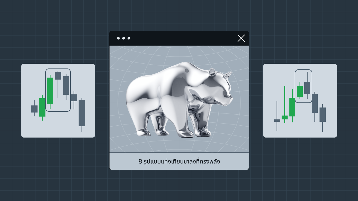
แท่งเทียนขาลงมักจะมีสีแดงในแผนภูมิการเคลื่อนไหวของราคา ต่างจากแท่งเทียนขาขึ้นที่แสดงการเพิ่มขึ้นของราคาสินทรัพย์ รูปแบบแท่งเทียนขาลงแสดงการเคลื่อนไหวของราคาที่ลดลงทีละน้อย การจดจำแนวโน้มเหล่านี้ในการเคลื่อนไหวของราคาจะช่วยให้เทรดเดอร์พบช่วงเวลาที่ดีที่สุดในการเปิดการซื้อขาย ดังนั้นการศึกษารูปแบบเหล่านี้จึงเป็นสิ่งสำคัญสำหรับการซื้อขายที่ประสบความสำเร็จและได้กำไร โดยทั่วไปแล้วรูปแบบแท่งเทียนขาลงมีอยู่แปดรูปแบบด้วยกัน โดยดูได้จากด้านล่างเลย
Shooting Star
Shooting Star (ดาวตก) เป็นรูปแบบการกลับตัวขาลง หมายความว่ารูปแบบดังกล่าวบ่งชี้ถึงการเปลี่ยนแปลงของทิศทางราคา Shooting Star มีตัวเทียนที่สั้นและไส้เทียนด้านบนยาว ซึ่งบ่งชี้ว่าแนวโน้มขาขึ้นของการเคลื่อนไหวของราคาในตอนท้ายกลับเป็นขาลง
โดยทั่วไปแล้ว Shooting Star จะปรากฏขึ้นที่จุดสูงสุดของแนวโน้มขาขึ้น เมื่อสินทรัพย์เปิดสูงและยังคงซื้อขายกันสูงขึ้นเรื่อยๆ แต่ในตอนท้ายก็ร่วงลงและปิดใกล้กับราคาเปิด Shooting Star แสดงให้เห็นว่าแม้จะมีความสนใจและความต้องการของผู้ซื้อ แต่ผู้ขายก็ยังสามารถดันราคาให้ต่ำลงจนได้
ตัวอย่างของรูปแบบ Shooting Star
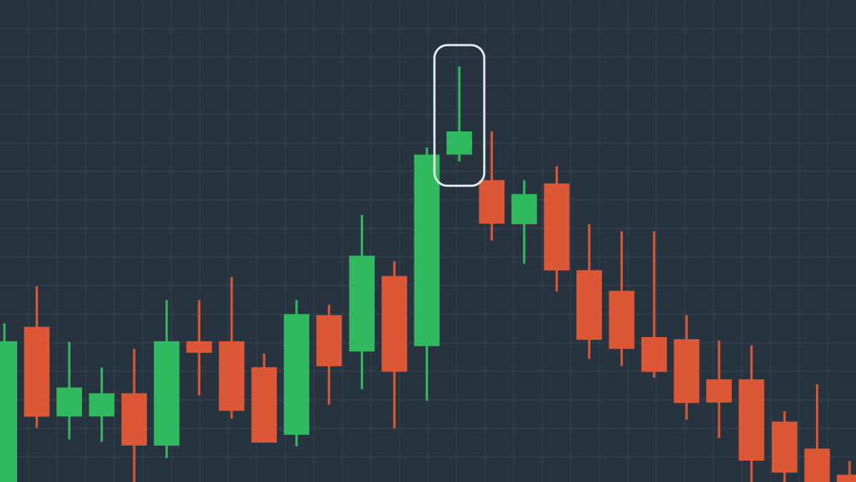
ดังที่เราเห็นจากแผนภูมินี้ Shooting Star จะปรากฏขึ้นที่จุดสูงสุดของขาขึ้น แต่การปฏิเสธราคาในภายหลังจากผู้ขายบ่งชี้ถึงการเริ่มต้นของแนวโน้มขาลงอันใหม่ ดังนั้นเราจึงสรุปได้ว่า Shooting Star น่าจะเป็นสัญญาณว่าราคาสินทรัพย์กำลังจะลดลง
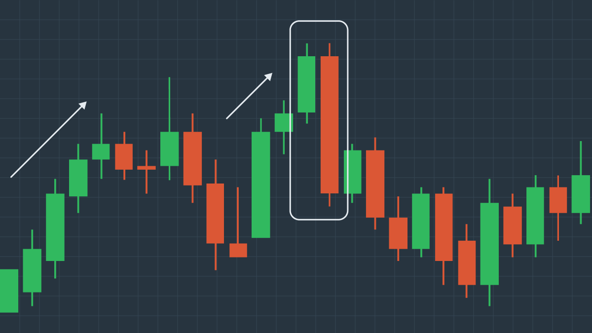
Bearish Engulfing Crack
รูปแบบ Bearish Engulfing (กลืนกินขาลง) ต่างจากรูปแบบก่อนหน้า เพราะมันประกอบด้วยแท่งเทียนเพียงสองแท่ง แท่งเทียนแท่งแรกเป็นขาขึ้นและแสดงให้เห็นว่าราคาปิดสูงกว่าราคาเปิดและผู้ซื้อเป็นผู้ควบคุมราคา ในทางกลับกัน แท่งเทียนแท่งที่สองเป็นขาลง มันกลืนกินแท่งเทียนขาขึ้นไปทั้งแท่ง และบ่งชี้ว่าในวันนี้ผู้ขายมีชัยชนะเหนือผู้ซื้อและผลักราคาลง
ถึงแม้ว่ารูปแบบนี้จะเป็นขาลง แต่มันก็ไม่ได้หมายความว่าจะเกิดการกลับตัวของราคาอย่างสมบูรณ์ ราคาสามารถร่วงลงต่อไปได้และคุณสามารถขายชอร์ตสินทรัพย์ของคุณได้อย่างปลอดภัย หรือไม่อย่างนั้น ราคาเหล่านี้ก็อาจขยับขึ้นไปและขัดขวางการซื้อขายของคุณ ดังนั้นก่อนที่จะทำการตัดสินใจใดๆ คุณไม่พิจารณาจากรูปแบบนี้เพียงอย่างเดียว ให้มองที่ภาพรวมใหญ่ๆ ว่าราคาของสินทรัพย์นี้มีแนวโน้มขาขึ้นหรือขาลงหรือไม่? คำตอบนี้จะช่วยให้คุณตัดสินใจได้อย่างถูกต้อง หากรูปแบบ Bearish Engulfing เกิดขึ้นหลังจากการปรับฐานขาขึ้นในแนวโน้มขาลงที่ใหญ่กว่าและใกล้ระดับแนวต้านขนาดใหญ่ ก็มีแนวโน้มว่าสัญญาณขายนั้นจะมีความน่าเชื่อถือ
ตัวอย่างของรูปแบบ Bearish Engulfing
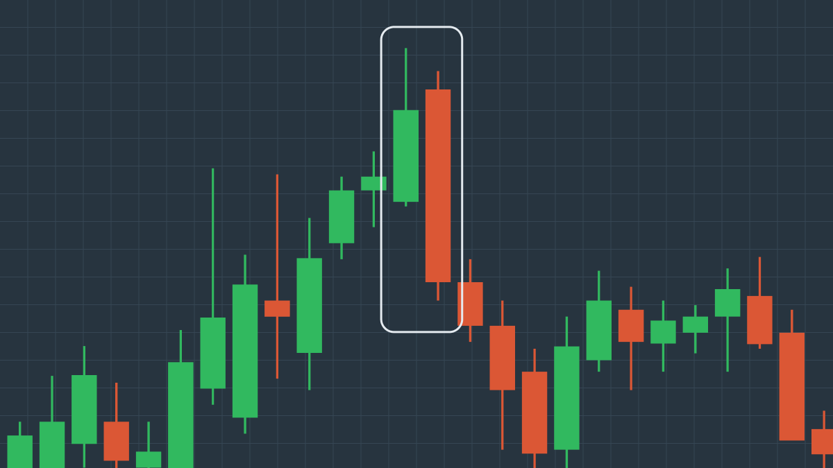
ในแผนภูมินี้ คุณจะเห็นได้ว่าหลังจากที่ราคาเพิ่มขึ้นเล็กน้อยแล้ว แท่งเทียนขาขึ้นจะตามมาด้วยแท่งเทียนขาลงที่กลืนกินอีกแท่งเทียนหนึ่งทั้งแท่งอย่างสมบูรณ์ รูปแบบ Bearish Engulfing นี้ตามมาด้วยการร่วงลงของราคาในทันที ซึ่งสอดคล้องกับแนวโน้มขาลงทั่วไปของราคาสินทรัพย์
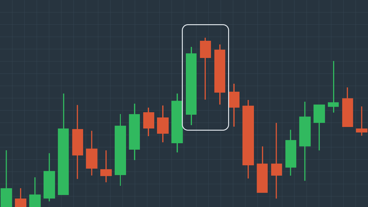
Evening Star
Evening Star (ดาวยามเย็น) เป็นอีกรูปแบบหนึ่งที่บ่งบอกถึงการกลับตัวของราคาขาขึ้น Evening Star ทั่วไปประกอบด้วยแท่งเทียน 3 แท่ง แท่งเทียนแท่งแรกเป็นขาขึ้นและแสดงให้เห็นว่าราคามีการเพิ่มขึ้นต่อเนื่องอย่างรวดเร็ว แท่งเทียนแท่งที่สองนั้นสั้นมาก เนื่องจากอุปสงค์ของสินทรัพย์ลดลงและราคาเพิ่มขึ้นช้า แท่งเทียนแท่งที่สามซึ่งเป็นแท่งเทียนแท่งสุดท้ายของรูปแบบนั้นเป็นขาลง ต่างจากแท่งเทียนสองแท่งแรก โดยราคาเปิดในวันที่สามต่ำกว่าวันที่สองอย่างเห็นได้ชัดและปิดต่ำกว่าเดิม แท่งเทียนนี้บ่งชี้ว่า ในวันที่สามนั้นขาลงมีความได้เปรียบมากกว่า ดังนั้นราคาจึงเริ่มลดลง
Evening Star ถือเป็นเครื่องหมายที่น่าเชื่อถือพอสมควรสำหรับแนวโน้มที่เป็นขาลงอย่างต่อเนื่องในการเคลื่อนไหวของราคา
ตัวอย่างของรูปแบบ Evening Star
แผนภูมินี้แสดงรูปแบบของ Evening Star โดยทั่วไป ราคาของสินทรัพย์พุ่งขึ้นอย่างช้าๆ แต่มั่นคง เมื่อมันพุ่งขึ้นอย่างกะทันหันแล้ว หลังจากนั้นก็จะกลับตัว และร่วงลงอย่างทันทีทันใด ซึ่งเป็นการส่งสัญญาณถึงแนวโน้มขาลงใหม่ในการเคลื่อนไหวของราคา
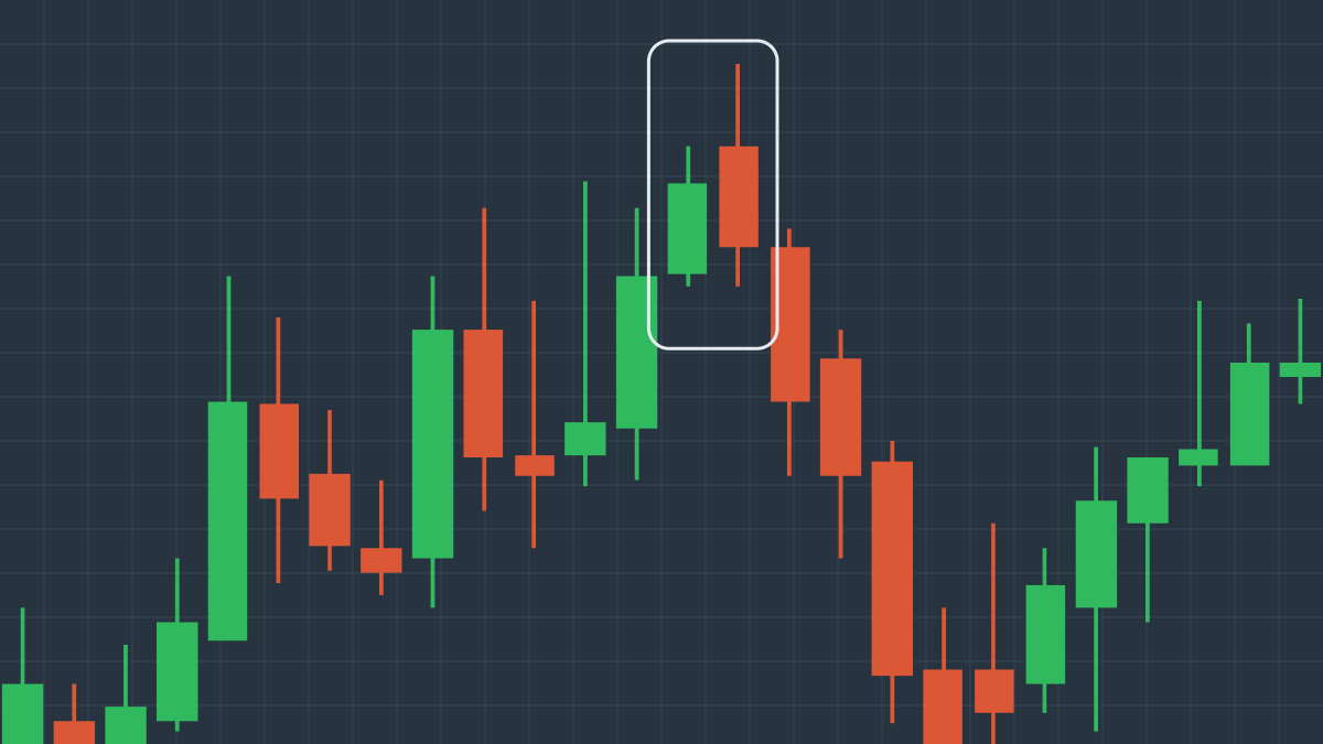
Tweezer Top
Tweezer top (ปากคีบด้านบน) เป็นอีกรูปแบบของแท่งเทียนขาลง 2 แท่ง Tweezer top สามารถจดจำได้ง่ายบนแผนภูมิราคา เนื่องจากแท่งเทียนทั้งสองมีระดับสูงสุดที่เกือบจะเท่ากันและเกิดขึ้นต่อกัน ความแตกต่างระหว่างแท่งเทียนสองแท่งนี้คือ แท่งเทียนแท่งแรกเป็นแท่งเทียนขาขึ้น ซึ่งบ่งชี้ว่าตลาดกระทิงสามารถยกระดับราคาขึ้นไปได้ ในขณะที่แท่งเทียนแท่งที่สองเป็นแท่งเทียนขาลง แสดงให้เห็นว่าตลาดหมีได้ดันราคาลงมาแทน
รูปแบบนี้แสดงให้เห็นว่าราคาสินทรัพย์ได้มาถึงจุดสูงสุด ณ เวลานั้น และผู้ซื้อไม่เต็มใจที่จะซื้อสินทรัพย์ในราคาที่สูงกว่าอีกต่อไป แผนภูมินี้แสดงการเริ่มต้นของแนวโน้มขาลงตามธรรมชาติในการเคลื่อนไหวของราคาสำหรับสินทรัพย์นี้โดยเฉพาะ
ตัวอย่างของรูปแบบ Tweezer Top
ดังที่เราเห็นในแผนภูมินี้ Tweezer Top เป็นรูปแบบที่เกิดขึ้นใกล้กับจุดสูงสุดของแนวโน้มขาขึ้น โดยมีแท่งเทียนขาลงต่อจากแท่งเทียนขาขึ้นซึ่งมีความสูงใกล้เคียงกัน หลังจากที่ Tweezer Top เกิดขึ้น ราคาก็เริ่มลดลงเนื่องจากหมียังคงมีอิทธิพลต่อราคาสินทรัพย์มากที่สุด
Dark Cloud Cover
Dark Cloud (เมฆมืด) เป็นอีกรูปแบบหนึ่งของแท่งเทียนขาลงที่สามารถคาดการณ์การกลับตัวของการเคลื่อนไหวของราคาได้ Dark Cloud ประกอบด้วยแท่งเทียนสองแท่ง คือแท่งเทียนขาขึ้นและแท่งเทียนขาลงที่เปิดสูงกว่าแท่งเทียนก่อนหน้าและปิดใกล้กับจุดกึ่งกลางของแท่งเทียนนั้น รูปแบบนี้แสดงให้เห็นว่าในช่วงวันที่สอง ผู้ซื้อสามารถผลักดันราคาให้สูงขึ้นได้จริง แต่ในท้ายที่สุด ผู้ขายก็เข้ายึดครองและกดราคาลงได้อย่างรวดเร็ว
แม้ว่า Dark Cloud จะถือว่าเป็นรูปแบบขาลง แต่ก็ไม่ได้เป็นข้อพิสูจน์ที่เพียงพอ คุณต้องระบุแนวโน้มขาขึ้นที่ชัดเจนเพื่อจะได้แน่ใจว่า Dark Cloud คาดการณ์แนวโน้มขาลงในการเคลื่อนไหวของราคา
ตัวอย่างของรูปแบบ Dark Cloud Cover
แผนภูมินี้แสดงให้เห็นว่าจริงๆ แล้ว Dark Cloud สามารถตีความว่าเป็นสัญญาณของการชะลอตัวที่กำลังจะเกิดขึ้นได้อย่างไร คุณจะเห็นได้อย่างชัดเจนว่าราคาสินทรัพย์อยู่ในช่วงขาขึ้น จากนั้นแท่งเทียนขาขึ้นจะตามมาด้วยแท่งเทียนขาลงที่เปิดสูงขึ้นแต่ปิดที่กึ่งกลางของแท่งเทียนก่อนหน้า รูปแบบนี้ตามมาด้วยชุดของแท่งเทียนขาลง ซึ่งบ่งบอกถึงการเริ่มต้นและความต่อเนื่องของแนวโน้มขาลงใหม่
Shrinking Candles
รูปแบบ Shrinking candles (แท่งเทียนที่หดตัว) ประกอบด้วยแท่งเทียนหลายแท่ง โดยแต่ละแท่งมีขนาดเล็กกว่าแท่งก่อนหน้า ส่งผลให้เกิดการกลับตัวของราคา เหตุผลที่อยู่เบื้องหลังก็คือความไม่สมดุลระหว่างอุปสงค์และอุปทานของสินทรัพย์: เมื่อผู้ขายจำนวนมากต้องการขายสินทรัพย์หนึ่งและมีผู้ซื้อจำนวนไม่มากนักที่ต้องการซื้อ ราคาของสินทรัพย์นี้ก็จะร่วงลงอย่างหลีกเลี่ยงไม่ได้ Shrinking candles สามารถช่วยทำนายผลลัพธ์ที่จะเกิดขึ้นนี้ได้ เนื่องจากขนาดที่หดตัวของแท่งเทียนขาขึ้นบ่งชี้ว่าราคาลดลง
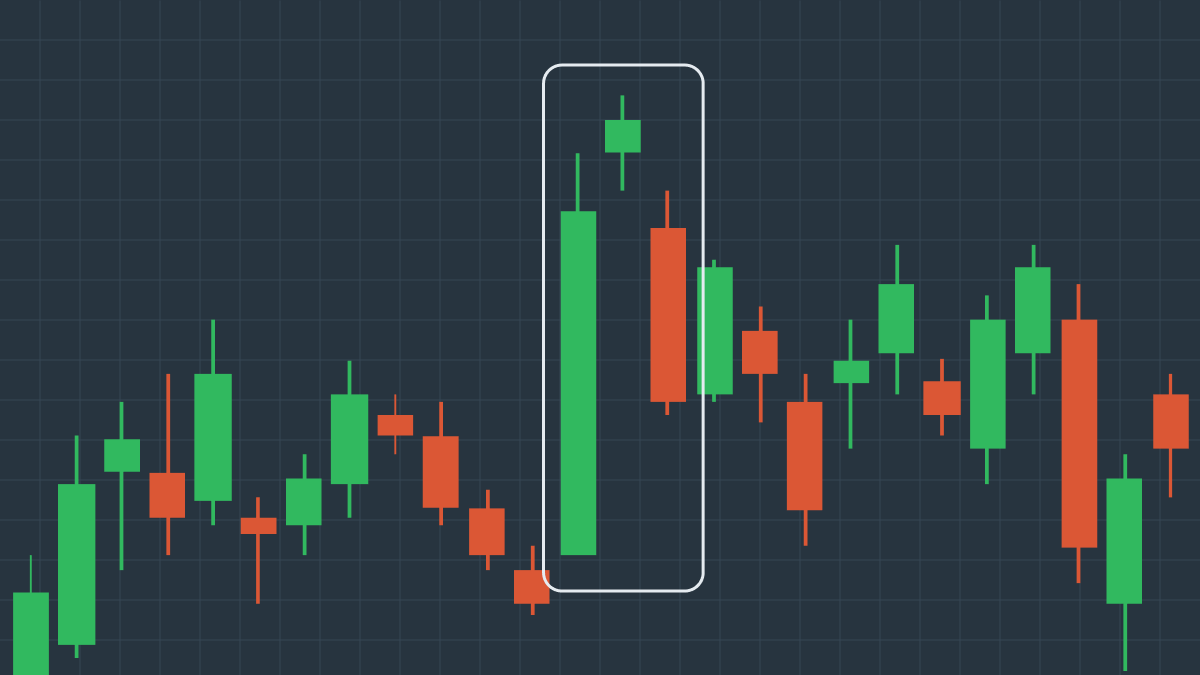
ตัวอย่างของรูปแบบ Shrinking Candles
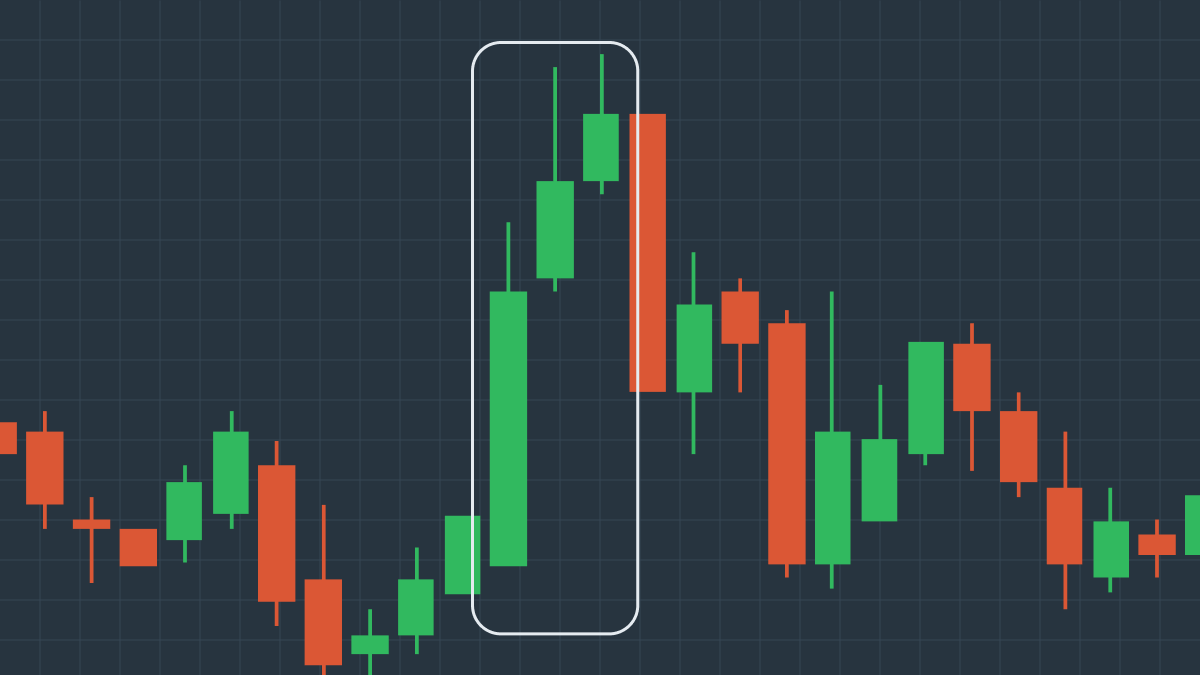
ในแผนภูมินี้ เราจะเห็นว่ารูปแบบนี้ประกอบด้วยแท่งเทียนขาขึ้นที่ตามมาด้วยแท่งเทียนที่สั้นกว่ามากสองแท่ง ซึ่งปิดท้ายด้วยแท่งเทียนขาลงที่มีราคาปิดต่ำกว่าราคาต่ำสุดของแท่งเทียนแท่งที่สอง นี่แสดงให้เห็นว่า แม้จะใช้ความพยายามทั้งหมดในการผลักดันราคาให้สูงขึ้น ผู้ขายก็สามารถตอบโต้พวกเขาและเปลี่ยนวิถีการเคลื่อนไหวของราคาได้
Hanging Man
Hanging Man (คนแขวนคอ) เป็นรูปแบบแท่งเทียนขาลงที่บ่งชี้ถึงความเป็นไปได้ที่สูงพอสมควรว่าราคาจะลดลง รูปแบบนี้จริงๆ แล้วประกอบด้วยแท่งเทียนแท่งหนึ่งที่มีตัวเทียนสั้นและไส้เทียนยาว โดยตัวเทียนอยู่ด้านบนสุดของช่วงของแท่งเทียน รูปแบบสามารถเป็นได้ทั้งขาขึ้นและขาลง และมักจะปรากฏที่ด้านบนของแนวโน้มขาขึ้น Hanging Man แสดงให้เห็นว่ามีแรงกดดันในการขายที่สังเกตได้ชัดเจนมาก ซึ่งทำให้การเคลื่อนไหวของราคาลดลง อย่างไรก็ตาม Hanging Man ไม่ใช่ตัวบ่งชี้การกลับตัวของราคาที่น่าเชื่อถือที่สุด ดังนั้นจึงควรมองหาสัญญาณอื่นๆ เพื่อเสริมการคาดการณ์ของคุณ
ตัวอย่างของรูปแบบ Hanging Man
แผนภูมินี้แสดงให้เห็นถึงการเพิ่มขึ้นอย่างต่อเนื่องของราคาสินทรัพย์ แต่แท่งเทียนที่ตัวเทียนสั้นและไส้เทียนยาวปรากฏขึ้นที่จุดสิ้นสุดของแนวโน้มขาขึ้นอย่างกะทันหัน ส่งผลให้เปลี่ยนเส้นทางการเคลื่อนไหวของราคาและเริ่มแนวโน้มขาลงใหม่ ดังนั้น สิ่งสำคัญคือต้องดำเนินการอย่างรวดเร็วเมื่อคุณเห็นรูปแบบนี้ แต่ก็ให้มองที่ภาพรวมของการเปลี่ยนแปลงราคาสินทรัพย์ในปัจจุบันที่ใหญ่ขึ้นด้วย
Three Black Crows
Three Black Crows (อีกาดำสามตัว) เป็นอีกรูปแบบหนึ่งที่บ่งบอกถึงการกลับตัวของการเคลื่อนไหวของราคา อย่างที่คุณเดาได้จากชื่อ รูปแบบนี้ประกอบด้วยแท่งเทียนขาลงสามแท่ง (มักจะเป็นแท่งที่มีตัวเทียนยาว) ที่เปิดสูงกว่าแท่งเทียนก่อนหน้า แต่ปิดต่ำกว่ามาก รูปแบบนี้แสดงให้เห็นว่าผู้ขายสามารถดันราคาสินทรัพย์ลงได้ถึงสามครั้งติดต่อกัน และตอนนี้ก็แซงหน้าผู้ซื้อไปแล้ว
Three Black Crows เป็นรูปแบบขาลงที่เห็นได้ชัดเจนมาก แต่ก็ยังจำเป็นต้องใช้ตัวชี้วัดทางเทคนิคอื่นๆ เพื่อยืนยันว่ามันคาดการณ์การตกต่ำของราคาสินทรัพย์ได้จริงๆ
ตัวอย่างของรูปแบบ Three Black Crows
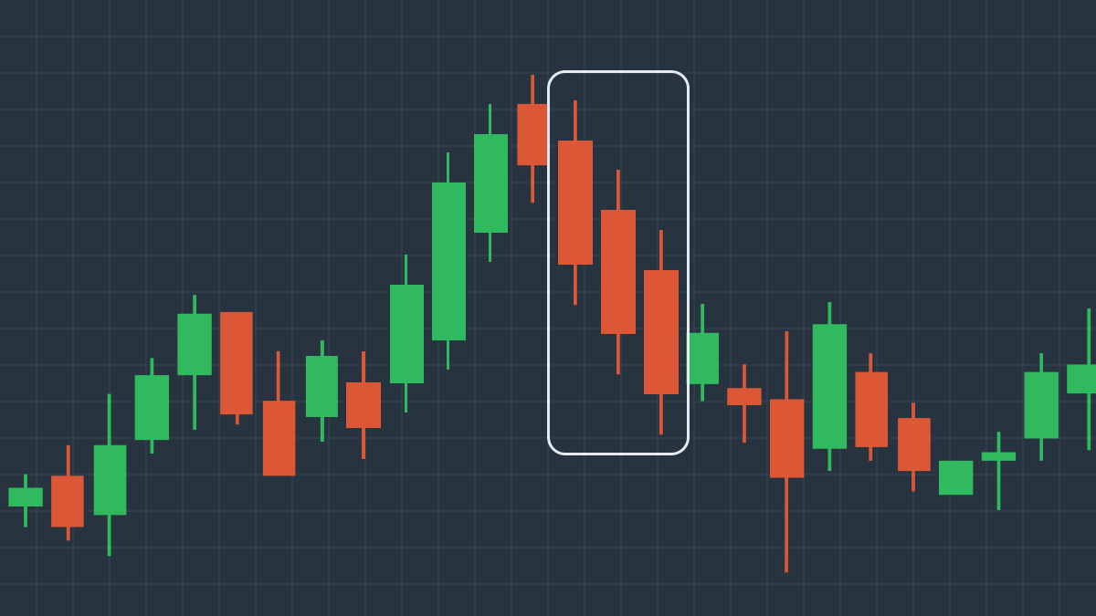
แผนภูมินี้แสดงแนวโน้มขาขึ้นที่ช้าแต่มั่นคงโดยมีแท่งเทียนขาลงจำนวนเล็กน้อยที่กระจายอยู่ตรงนั้นทีตรงนี้ที ดังนั้น จนกว่าเราจะพบแท่งเทียนขาลงสามแท่งที่มีไส้เทียนสั้นมากๆ ที่ปิดต่ำกว่ากันมาก หลังจากนั้น การเคลื่อนไหวของราคาก็ลดลง ซึ่งบ่งชี้ว่ารูปแบบ Three Black Crows เป็นตัวบ่งชี้ที่น่าเชื่อถือของราคาที่ลดลง
หากคุณต้องการเชี่ยวชาญรูปแบบแท่งเทียนญี่ปุ่นเพิ่มเติม ลองดูคอร์สเรียนฟรีของ FBS